Asked with all seriousness by my friend, Green Granny how we could tell if things were getting worse or better (obviously things are getting worse at the moment) I had to ponder deeply. I have blogged on occasion about the need for real action – not protests or petitions – that actually achieves something tangible, and the crux seems to be that unless the actual damage we are doing to the planet is reducing as a result of something that has been done, then that thing cannot be said to have been successful.
When the Sierra Club or WWF next claim “great success” in getting a bill before congress, this is just pollen in the wind : will the bill be passed? Will it be enforced? Will emissions (or whatever) be reduced as a result of the bill? Will the amount of greenhouse gases in the atmosphere go down because of the bill? Will the Earth’s temperature go down because of the bill?
I don’t care that a nation’s greenhouse gas emissions or production of toxins have gone down if, in order to achieve this, there has been a commensurate rise elsewhere. This is not a success – it is a shifting of responsibility. Success has to be judged on the big picture.
A environmental success is only a success if the end result is a net reduction in the damage being done?
If we are to measure that success, if it ever happens, we should be watching the global figures; the counters that show how much carbon dioxide, methane, nitrous oxide, HFCs and black soot are in the atmosphere; the counters that show the mean global temperature over the last 5 years; the counters that show the size of the polar ice caps and the mountain glaciers. We need to see these counters, they need to be accurate and scientifically verified, they need to be easy to read by everyone and they should be available as soon as possible.
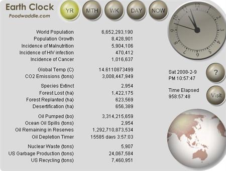
At the moment all I can find are averaged numbers based on long-term figures. They will have to do for the moment. The image at the top of this article shows the Poodwaddle Earth Clock. It’s a simple to use flash object consisting of many counters; it looks nice and it does its job very well. I can’t vouch for the figures, though: they could be complete rubbish, or they could be brilliantly extrapolated. Treat this as a sign of the times, not a reference point. The creator also happens to be very religious; take from that whatever you wish.
Danny Bloom, he of the Polar Cities diagrams (a potent warning rather than a hopeful future) has started a blog based counter, and aims to keep the figures up to date. He is a very enthusiastic and creative individual, but it will need a very sound mind to verify the myriad of different figures coming out. I wish him well.
Cooling Man has a very basic clock of sorts, a simple counter of CO2 (equivalent), which differs from Danny’s “clock”. This is confusing, and a big reason why there needs to be concensus over the management of counters for things as complex as greenhouse gases. Unfortunately Cooling Man believes in carbon offsetting, which is the equivalent of kicking someone in the head while giving sweets to his friend. His suggestions for reducing emissions are not exactly revolutionary either : only radical changes will make a difference.
The search most definitely goes on.